Hornitos
New Product Development
BRAND STRATEGY|
BRAND CREATION|
GUIDELINES|
PHOTOGRAPHY|
PHOTOGRAPHY |
BRAND WORLD PACKAGING 2D & 3D|
PRINT CONSULTANCY|
ENVIRONMENT DESIGN|
BOOKLET|
SUSTAINABILITY
Elevating a legacy icon into the world of super-premium tequila
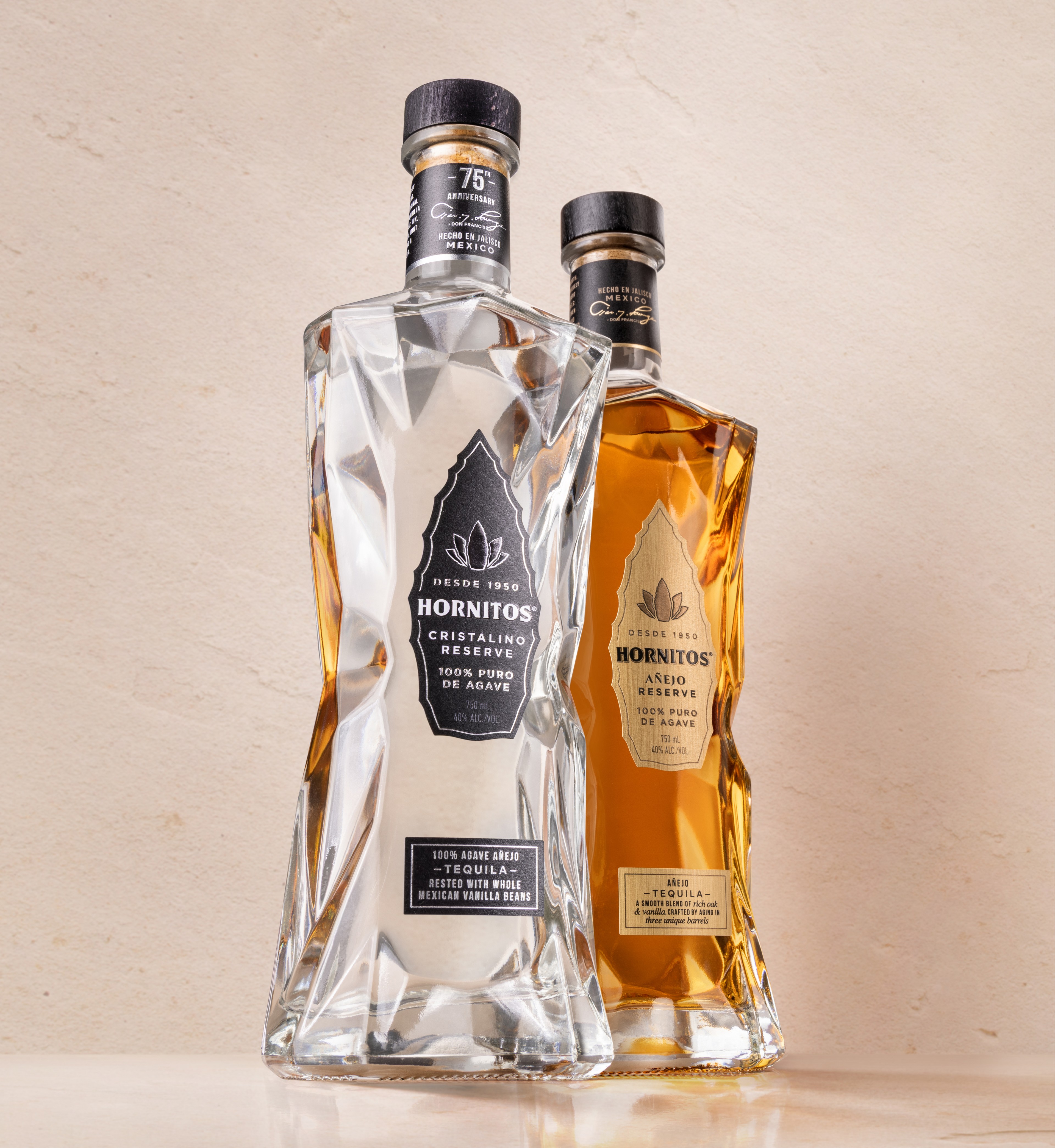
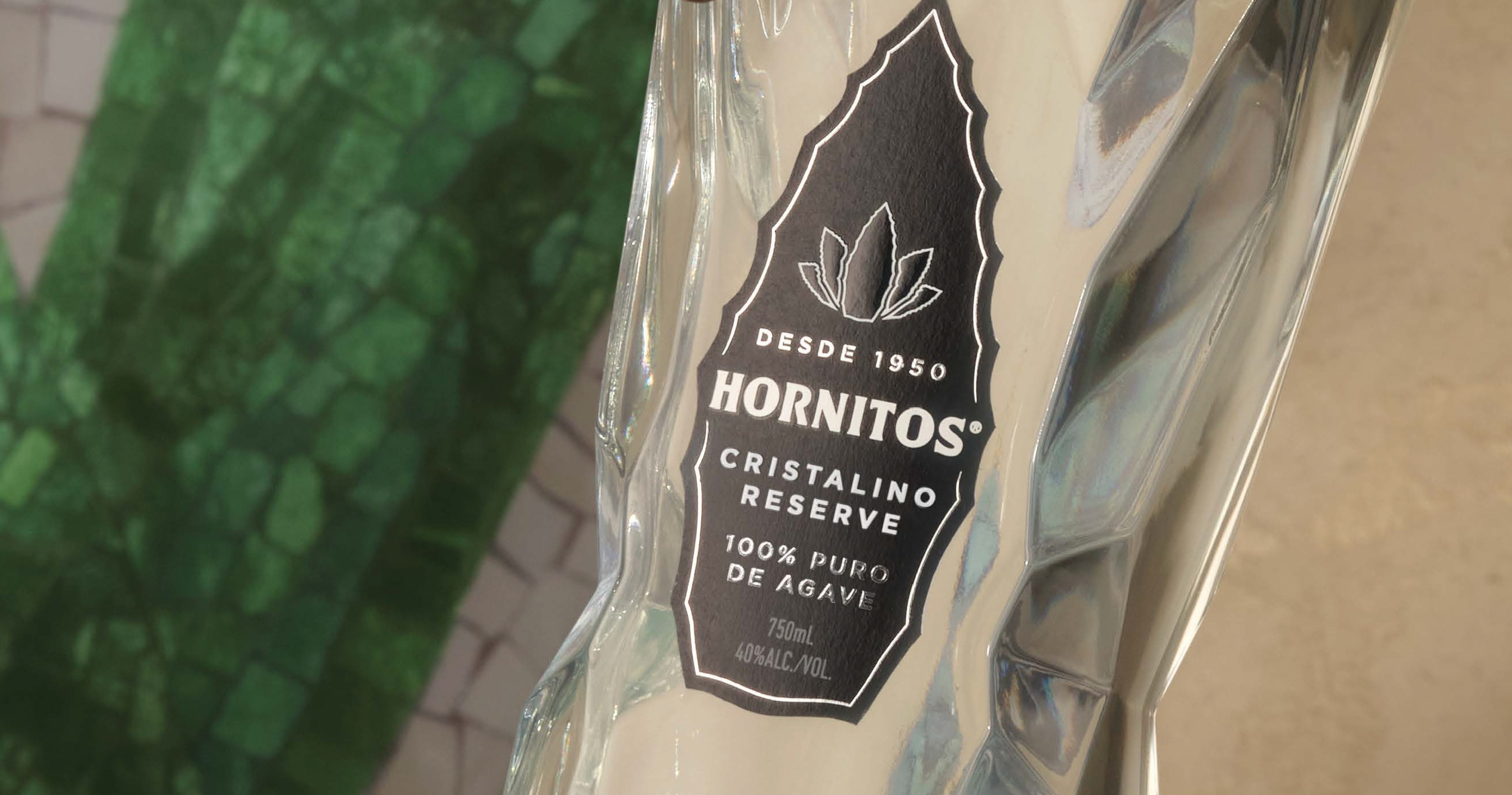
To mark Hornitos’ 75th anniversary, the brand set out to debut its first-ever super-premium SKU: Hornitos Cristalino. The ambition was clear, signal a new era for the brand by entering the upper tier of tequila, attract discerning new consumers, and reframe Hornitos as a serious player in the premium space, all while staying true to its vibrant, expressive roots.
Moving beyond the core range
Hornitos has long owned a fun, flavour-forward space within the category, known for bold character, bright green cues and great margarita moments. But Cristalino needed to prove that the brand could stretch up the ladder, becoming more elevated, more refined, but never losing its sense of confidence or ease.
Our design choices
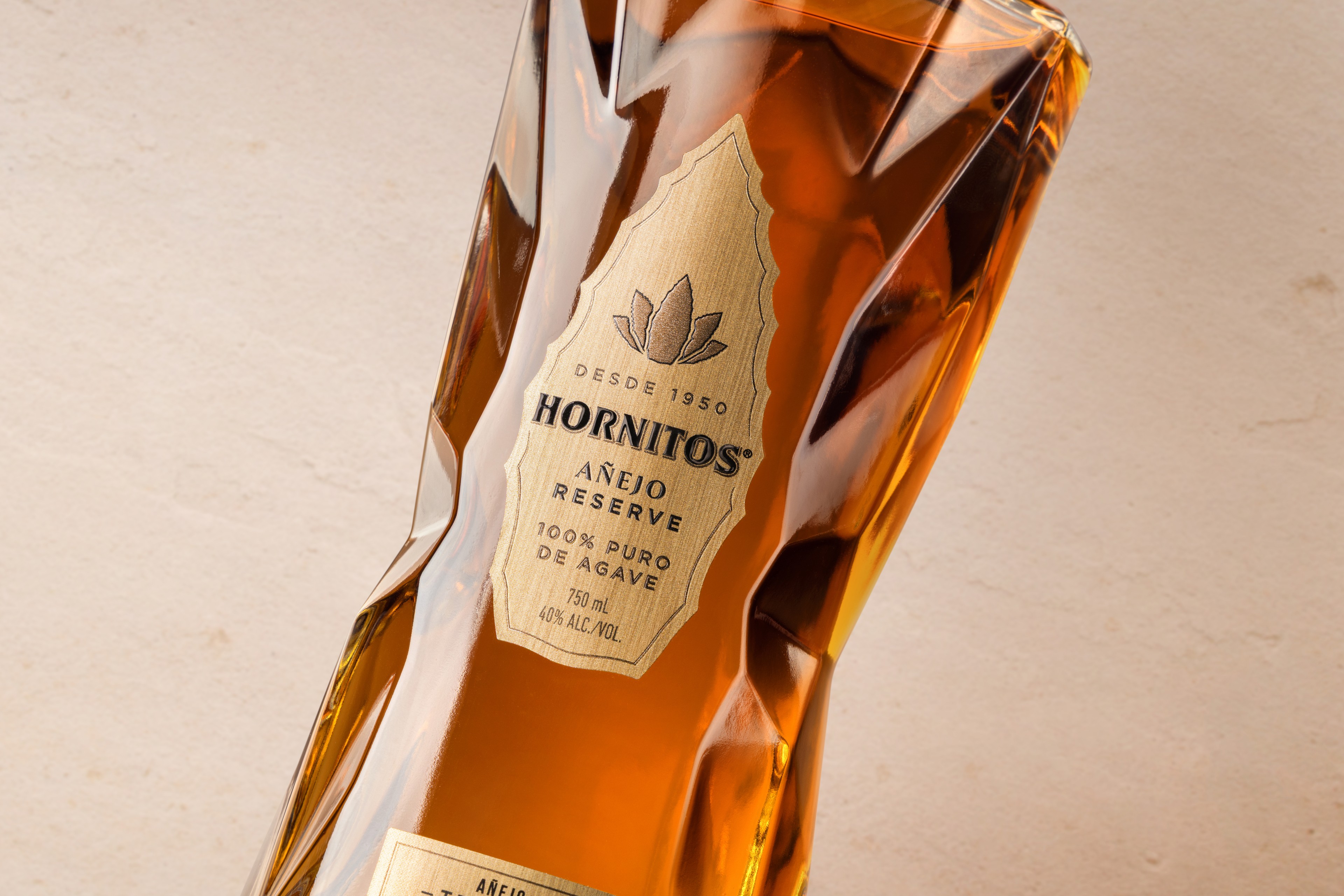
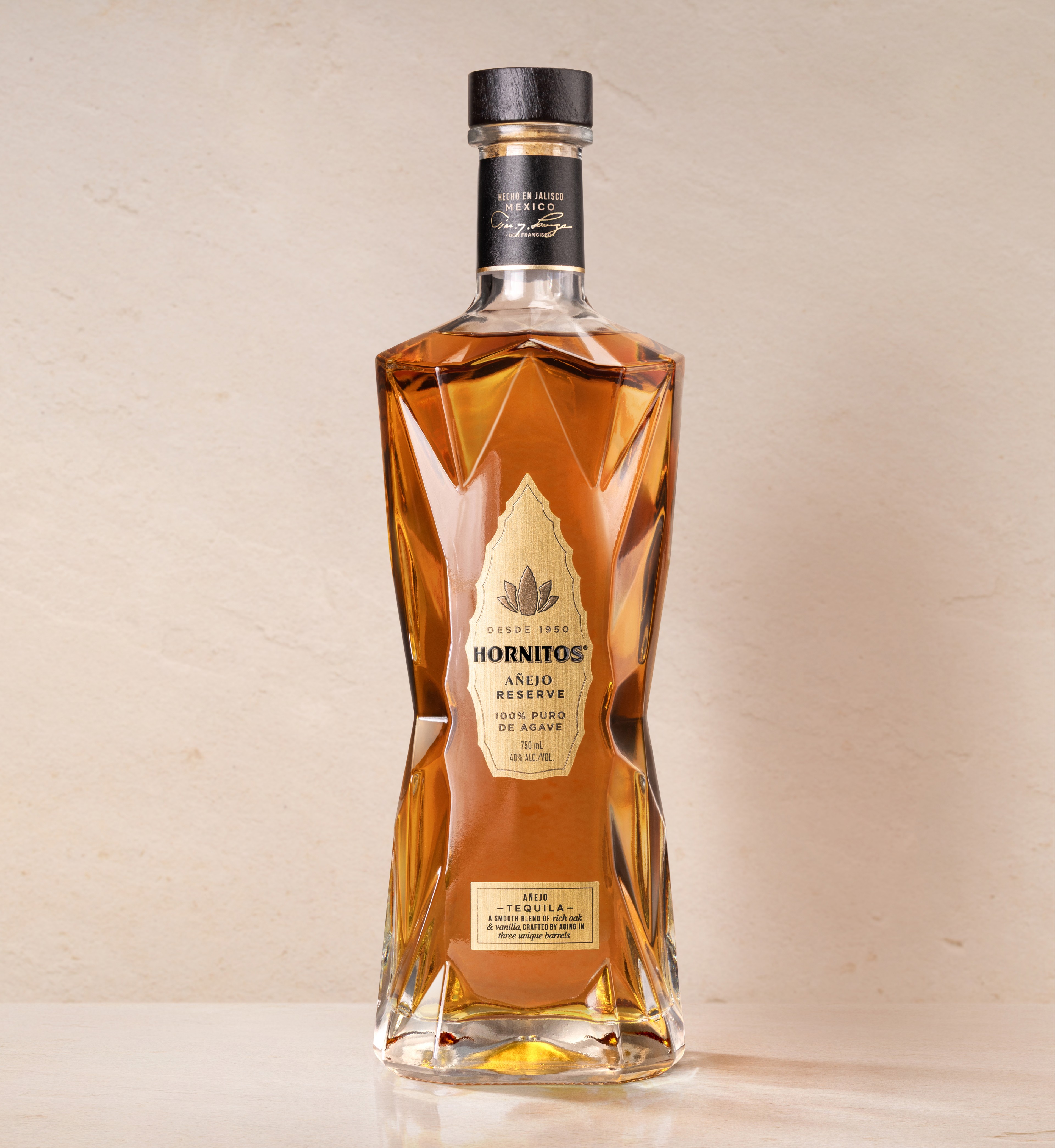
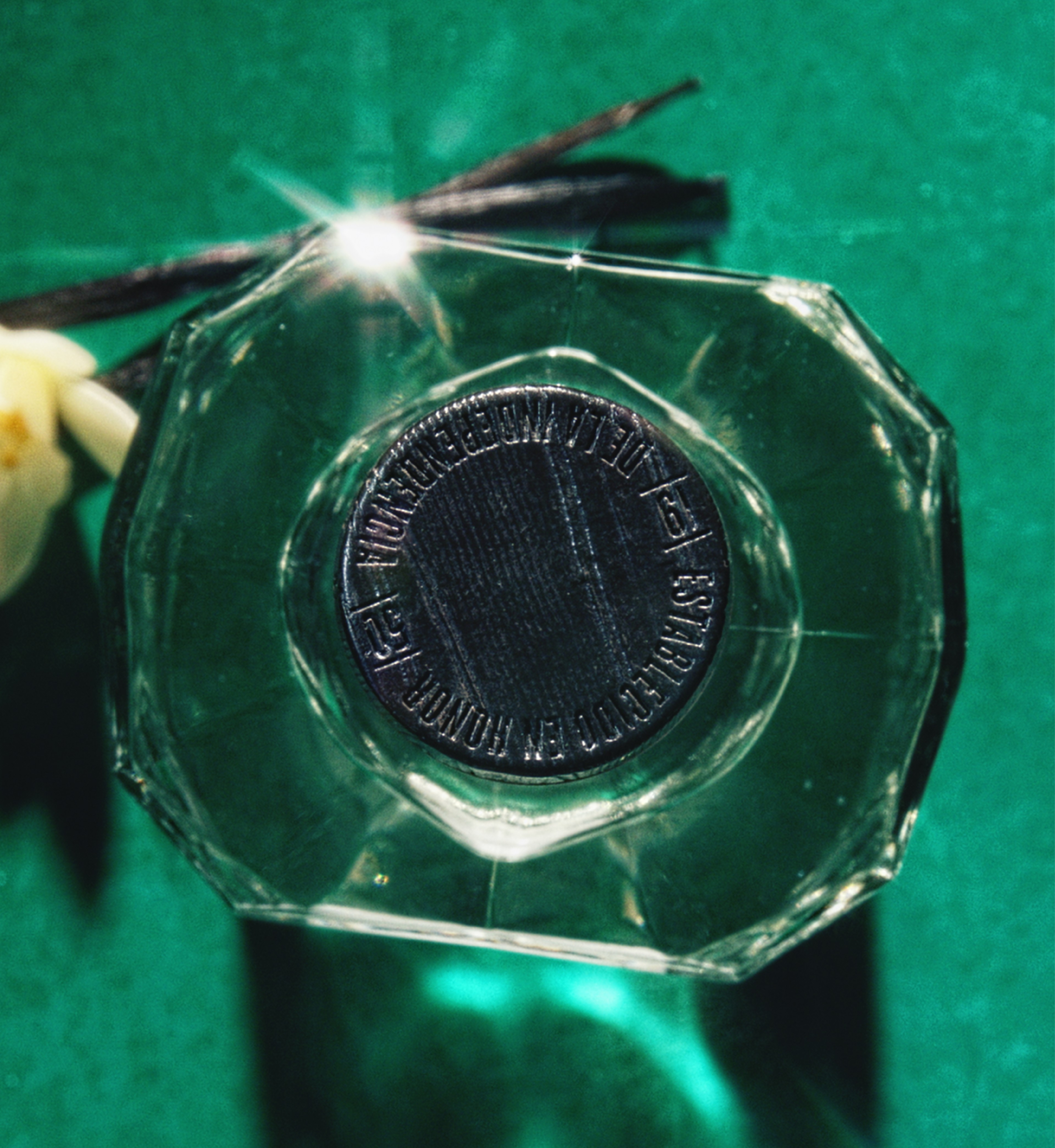
We created a sleek black label with silver metallic foil flourishes finished, nodding to the established codes of the Cristalino category, while dialling up the quality and visual impact. The label features uncoated paper stock, detailed embossing, and a more sophisticated take on the Hornitos brand world – one that feels premium but still playful. The multifaceted bottle, designed to reflect the purity and clarity of the liquid, anchors the design with presence and poise. Core brand equities were evolved with restraint and intention: the leaf reimagined with authentic precision, the logotype redrawn to with a nod to hornitos history, and the overall visual identity sharpened to reflect the shift in tier.
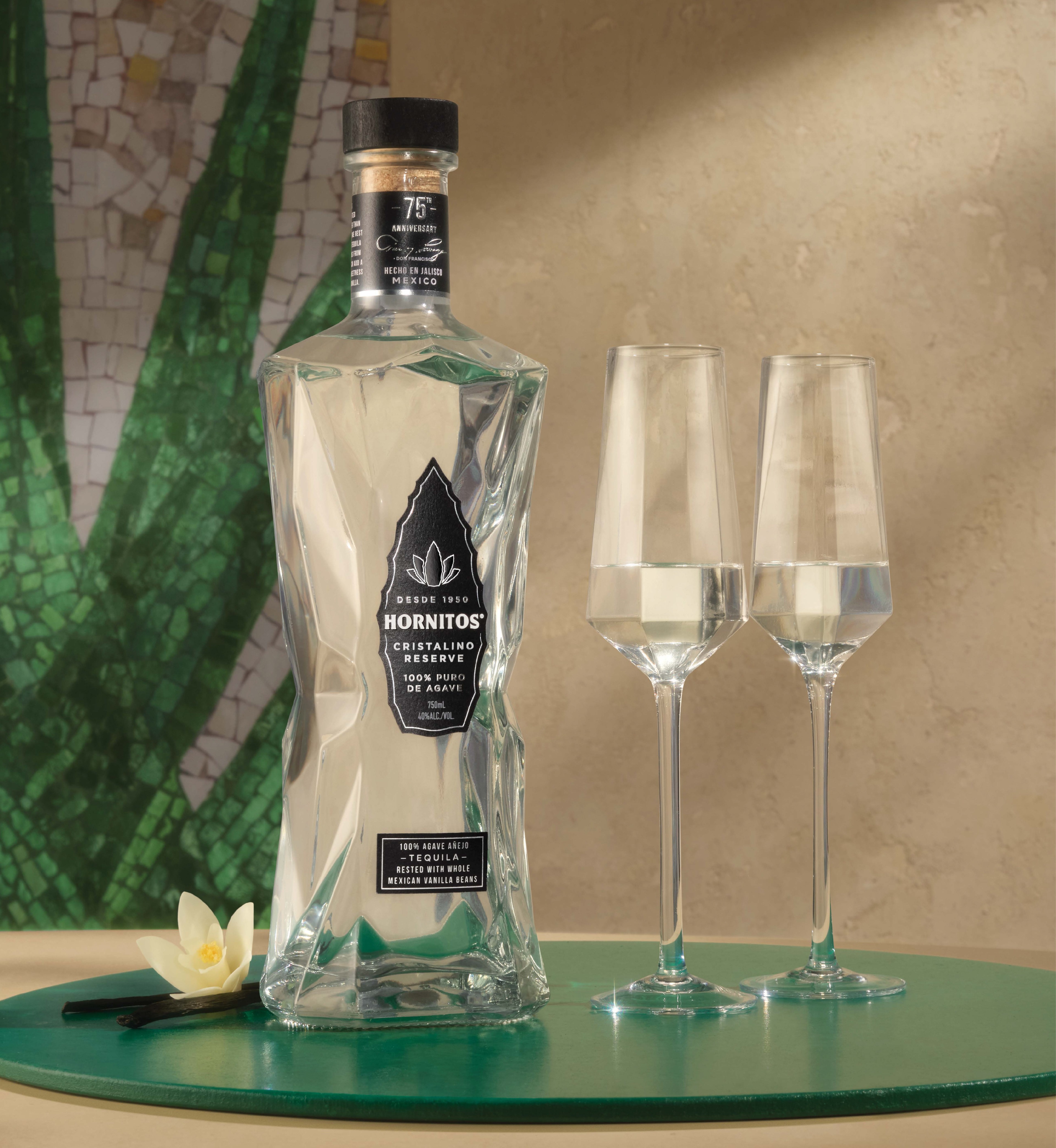
The prestige brand world
The brand world is brought to life through a mosaic pattern inspired by original tiling from the Tequila distillery - a subtle yet powerful nod to provenance and craft. Our palette for the brand world draws from authentically Mexican materials: warm sandstone, hand-laid mosaics, terracotta, and natural, hand-applied paint. We steer clear of clichés and overly-treated aesthetics, always prioritising realness and natural beauty.
Our videos showcase the cristalino liquid pouring with a sleek, tactile sensoriality, while also heroing the bottle’s finishes with craft and intention. The result is a design that feels confident, contemporary and unmistakably premium - a bold debut into the super premium world of tequila for one of the category’s most recognisable names.
Explore more of our WORK