Courvoisier
Brand Redesign
BRAND STRATEGY|
TYPOGRAPHY|
COPYWRITING|
PACKAGING 2D & 3D|
PRODUCTION CONSULTANCY|
SUSTAINABILITY|
BRAND WORLD|
MODELS & PROTOTYPING|
BOOKLET
Reigniting
an icon
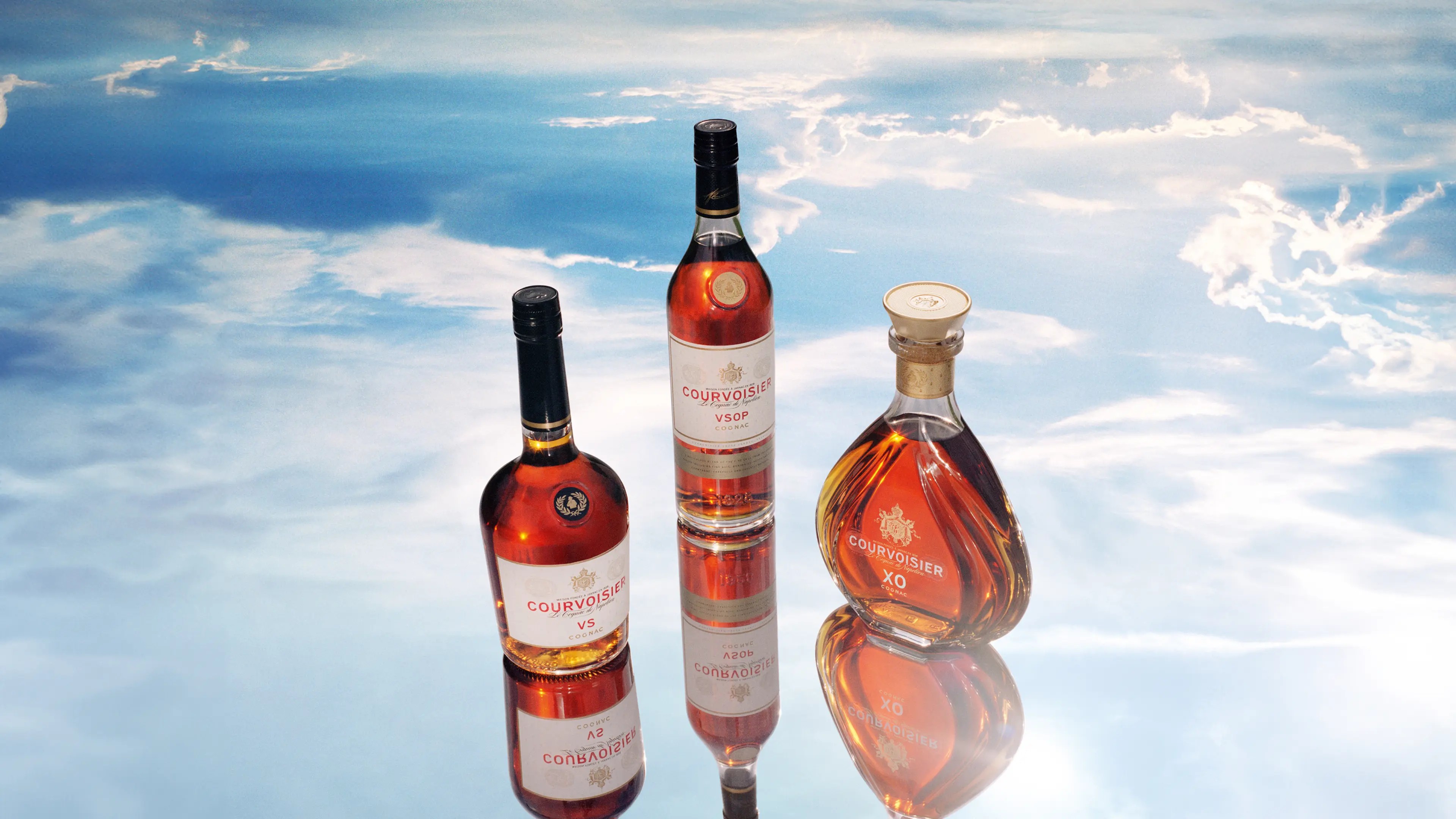
In the context of a cognac market seeing strong growth, Courvoisier (Campari) were looking to redesign their portfolio globally, including XO, VSOP and VS expressions. Consistency, premiumisation and sustainability were key to delivering a holistic look & feel, allowing it to stand out as a true global luxury player.
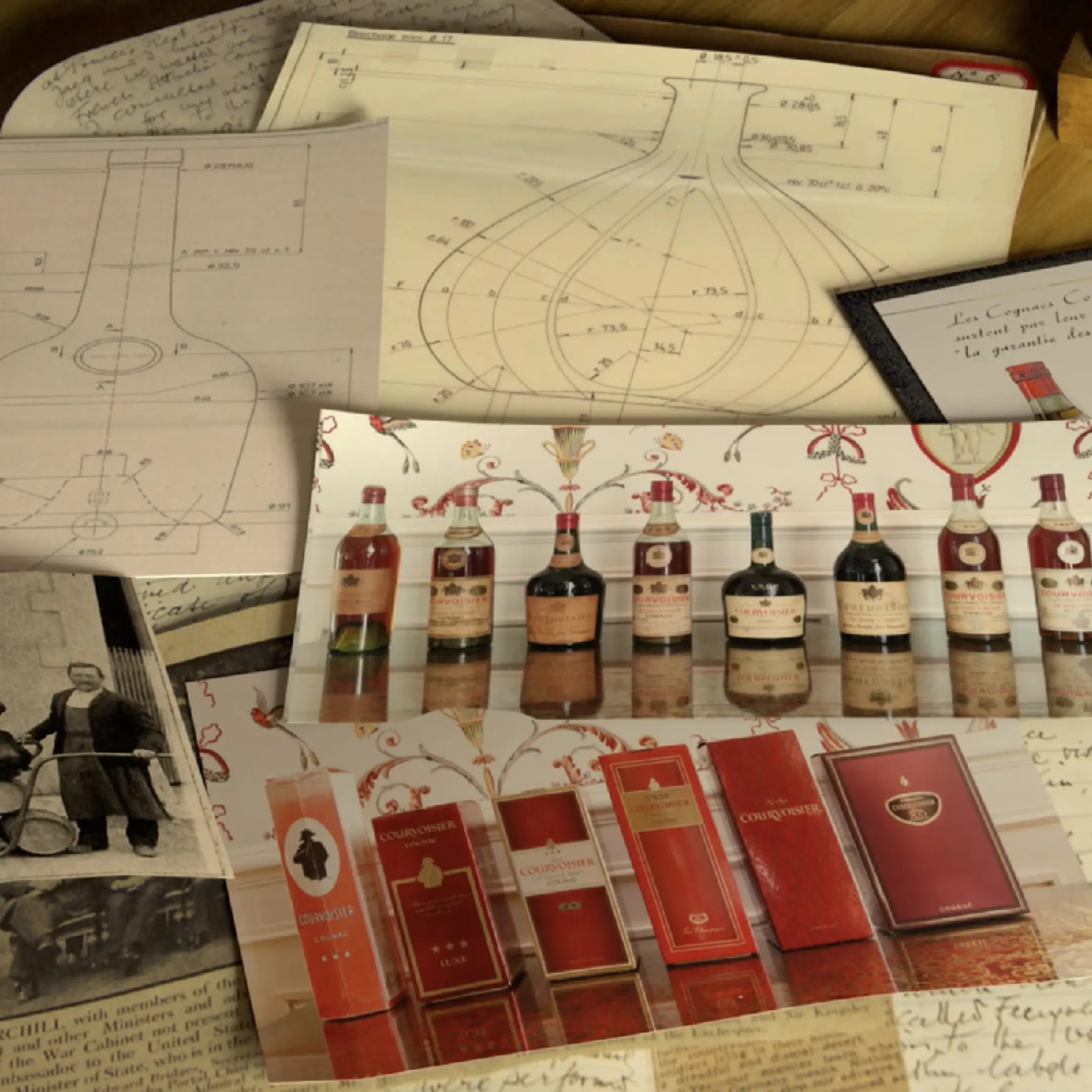
Heritage
reinvented
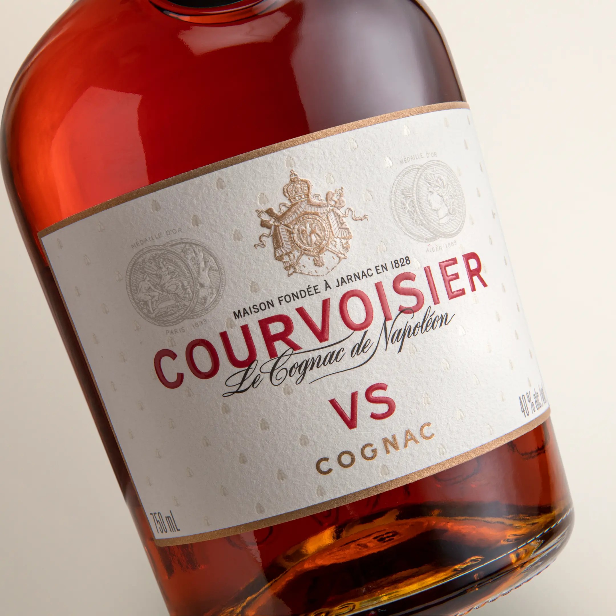
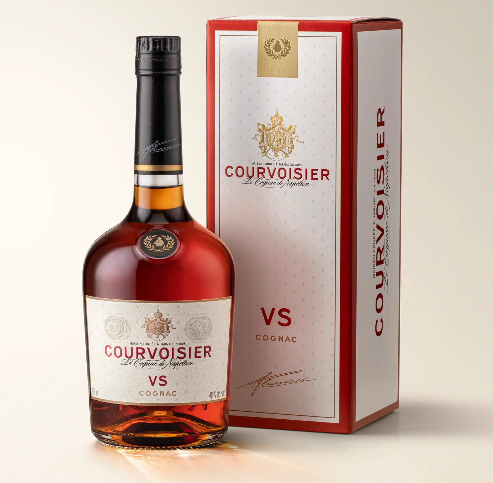
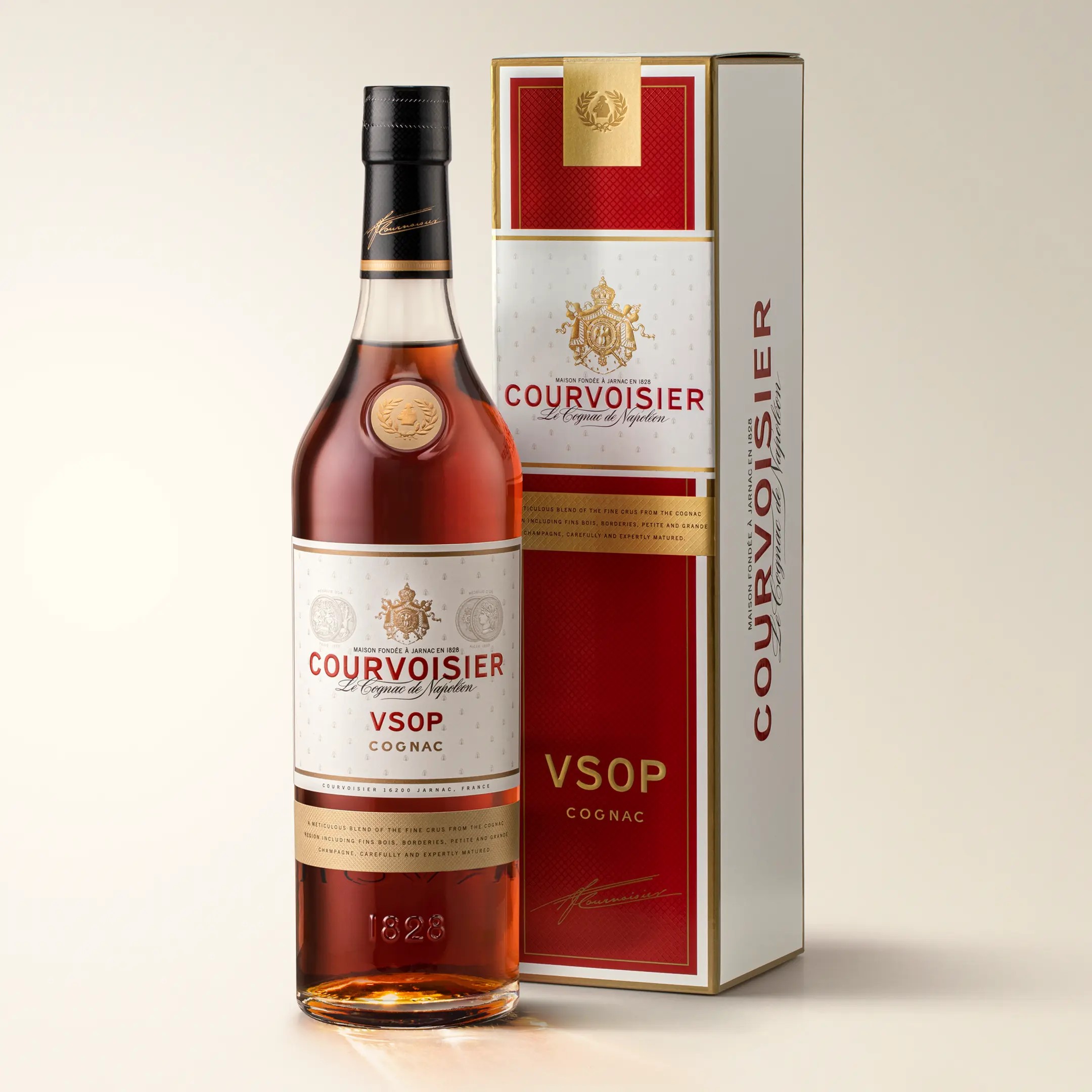
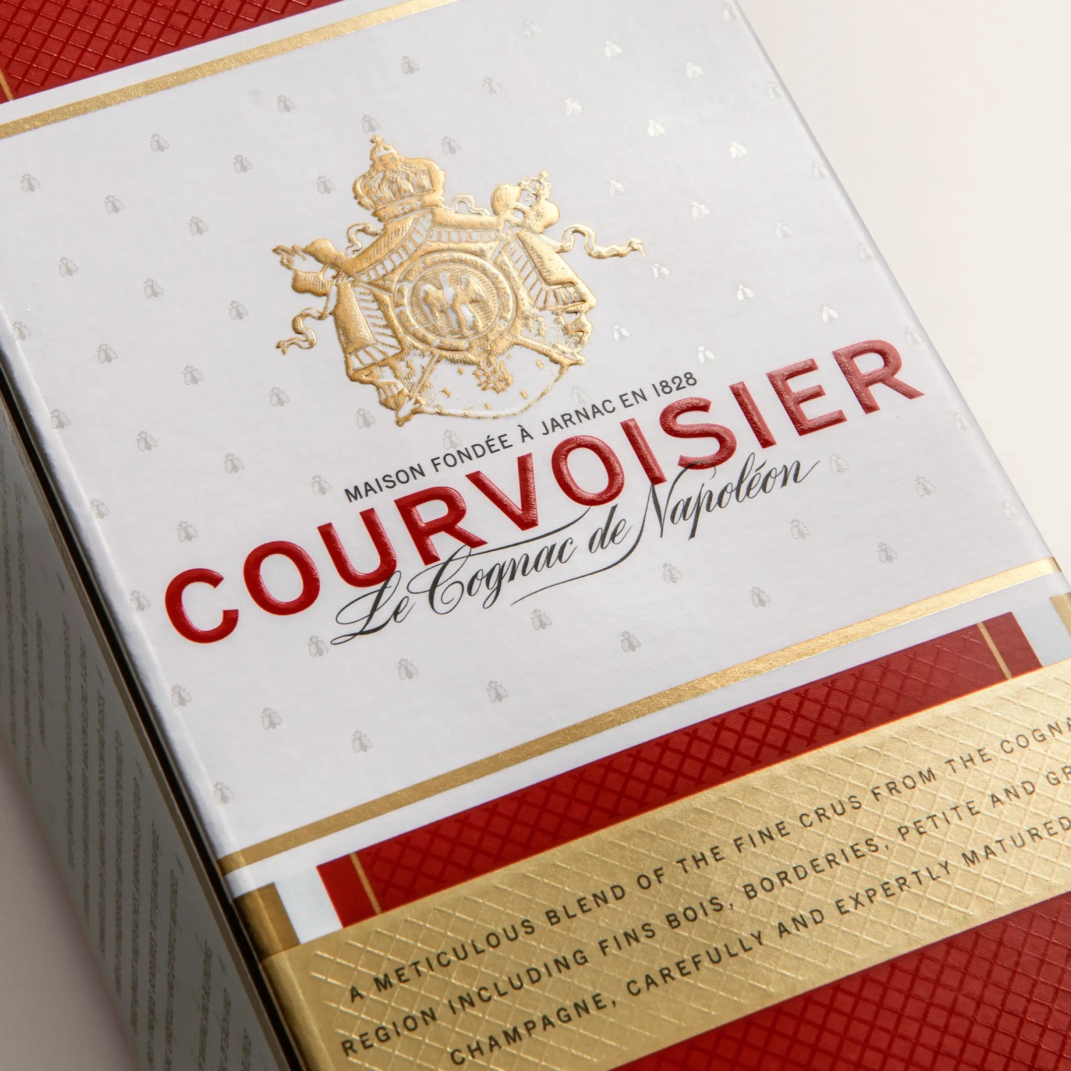
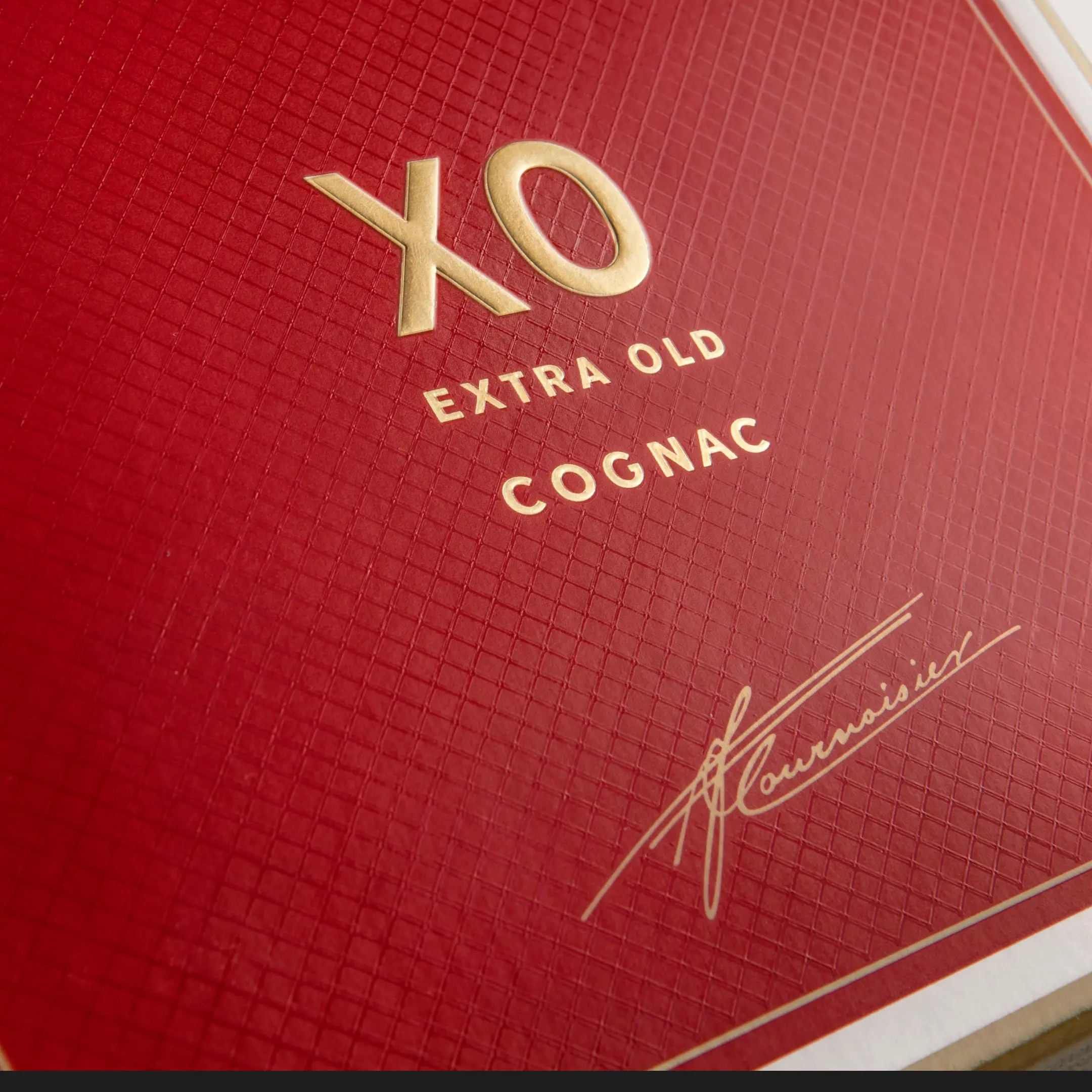
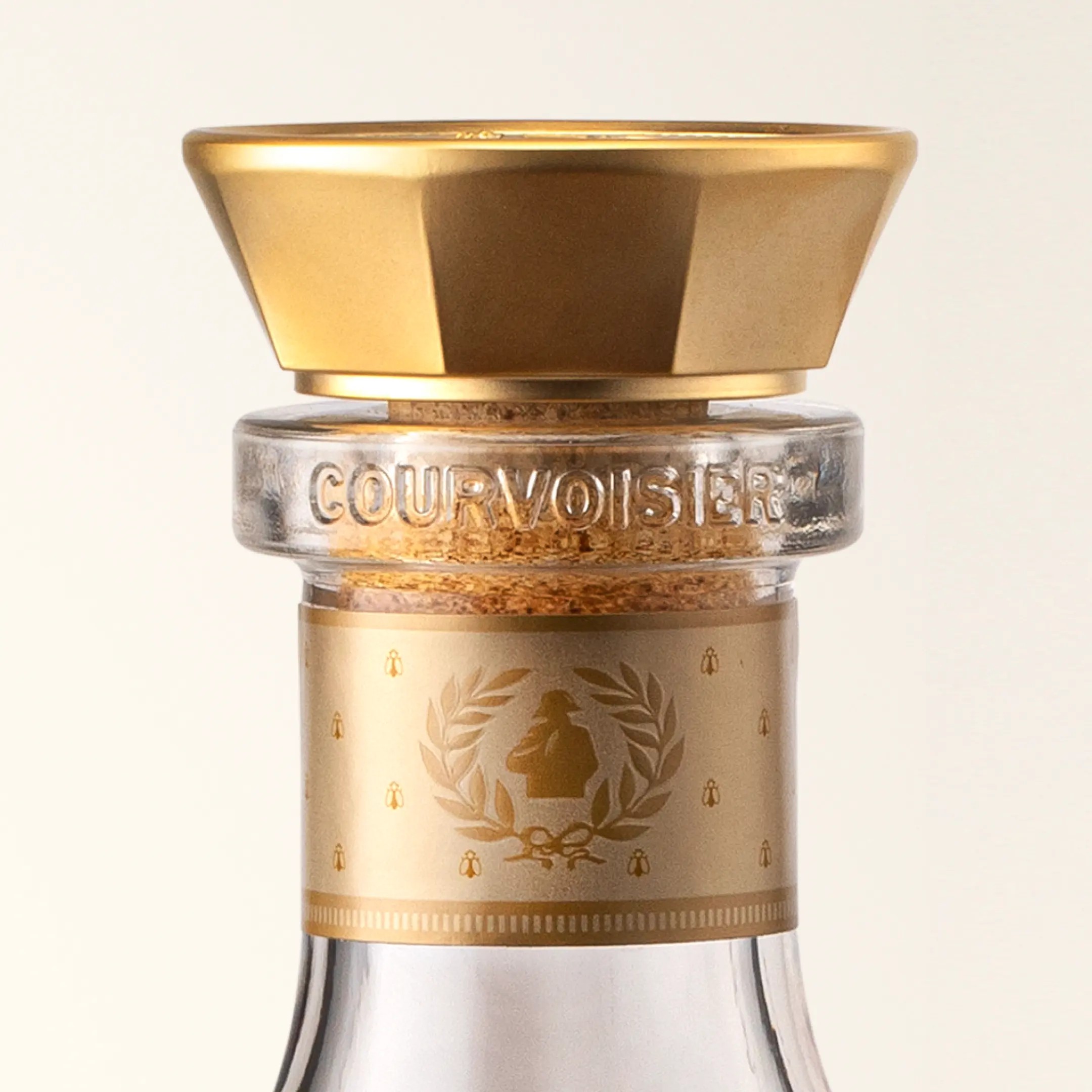
Taking inspiration from the brand archives in Jarnac, France we started our journey by reviving the heritage assets to deliver a modern manifestation of the brand’s historic codes. Reintroducing the iconic 1800s wordmark in its bold sans-serif red and crafting the original medals, crest and typefaces to create a contemporary yet authentic visual identity. The heritage palette was brought to life through a vibrant red, off-white, and rich gold to represent the brand’s vibrant ‘joie de vivre’ positioning and create disruption within the category.
Sustainable
luxury redefined
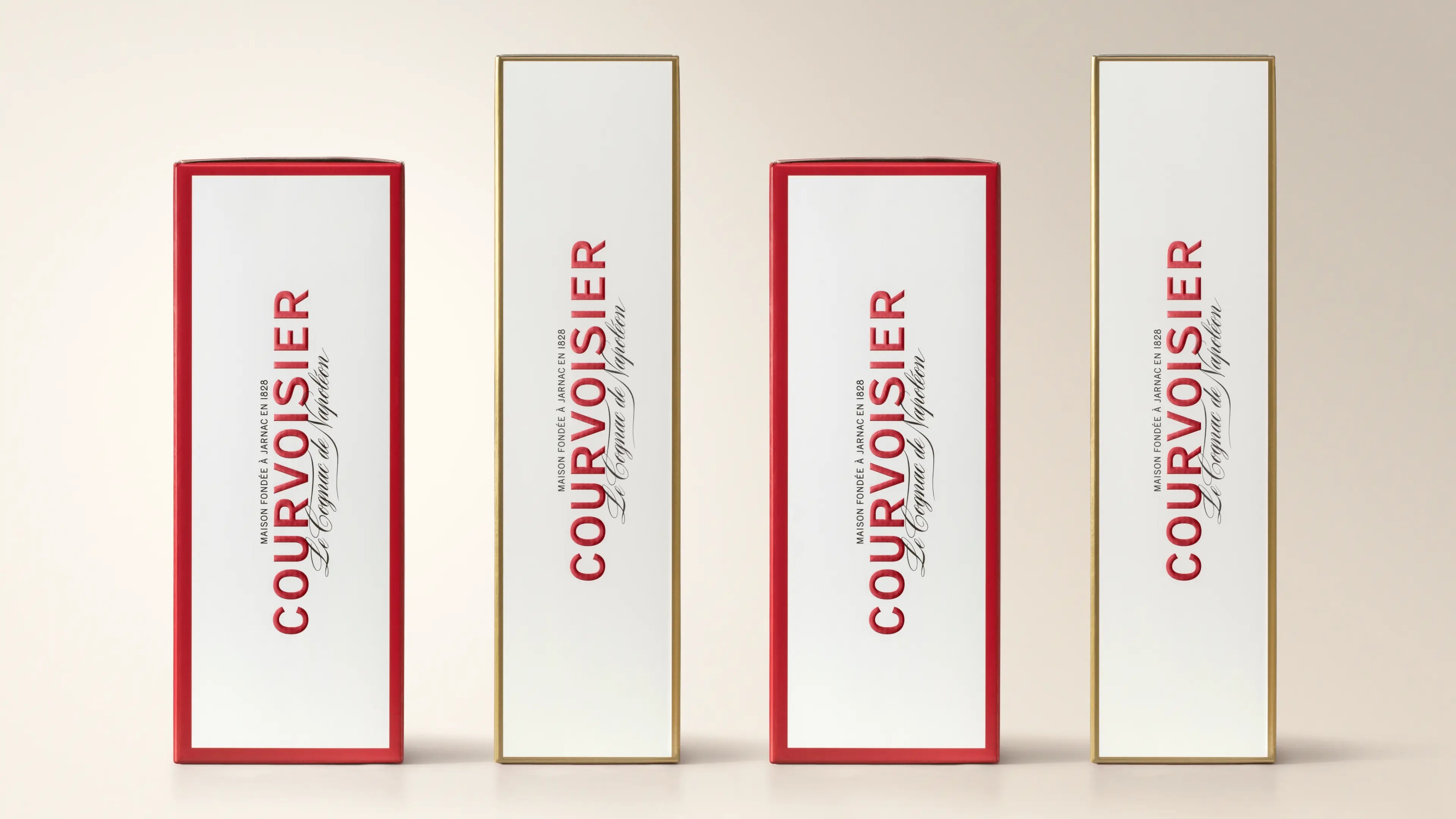
Sustainability was also a key driver in the redesign. We achieved a lower weight across all glassware, which resulted in a reduced CO2 footprint for the Maison. We also moved away from plastic closures to opt for more sustainable materials and made strides towards 100% recyclable packaging for the full range. For the highest volume SKUs featuring outer packaging we moved to corrugated cardboard gift boxes, which are finished beautifully to maintain a prestige quality while reducing overall weight. We also moved all labels and cartons to fully FSC certified materials.
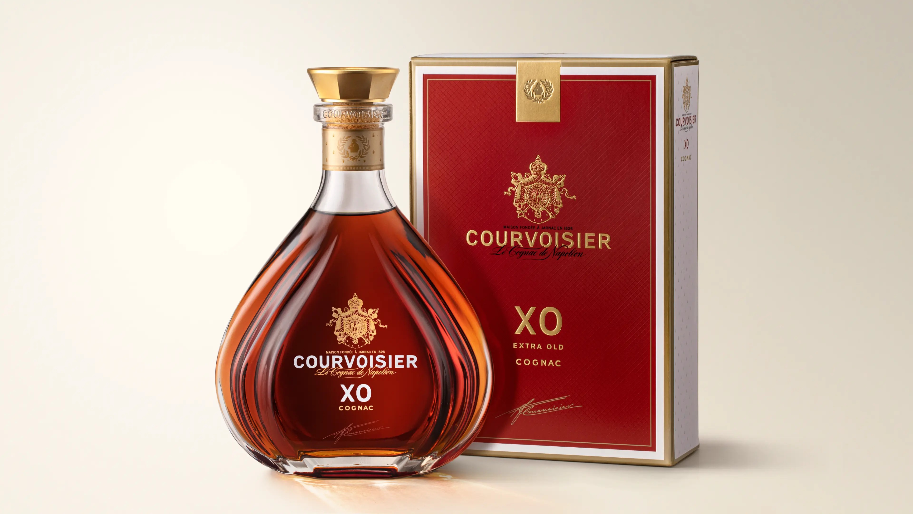
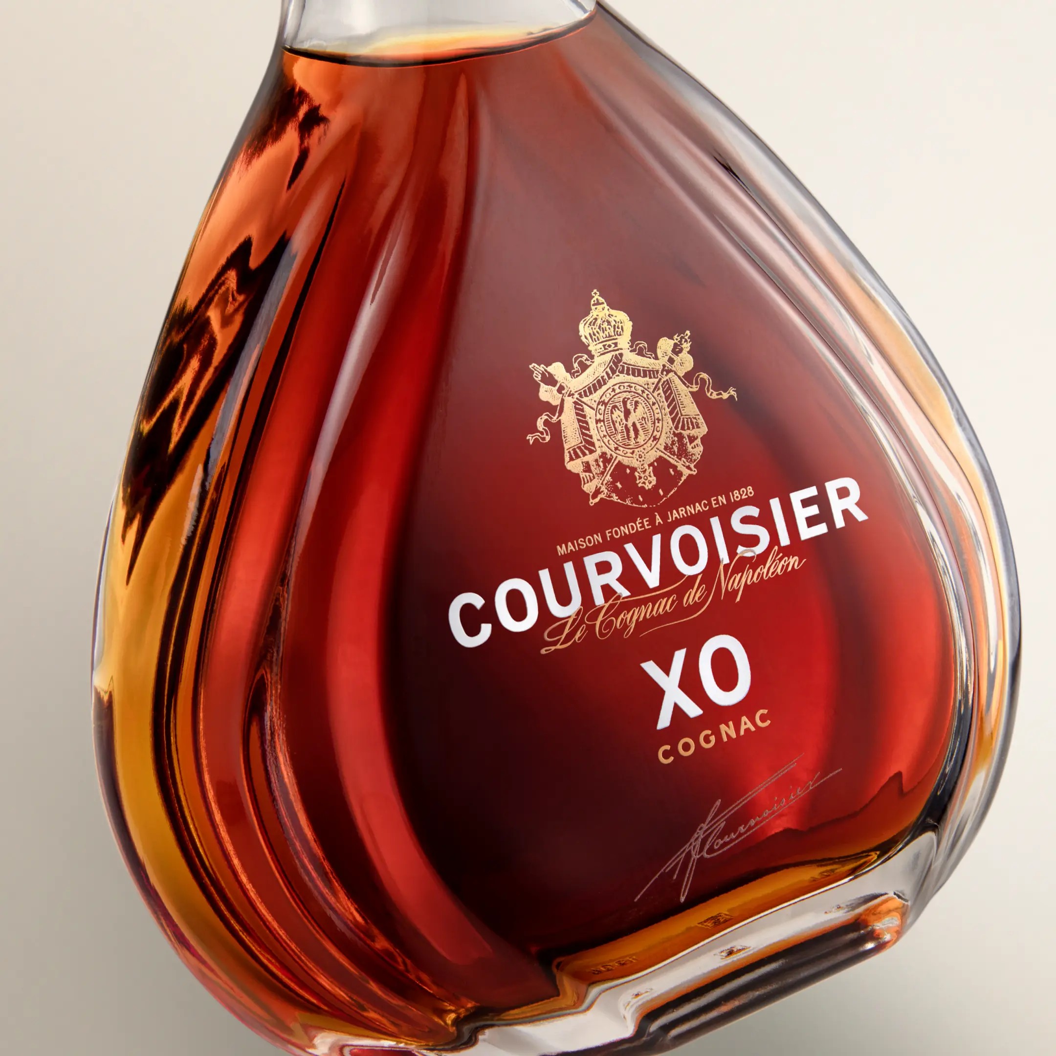
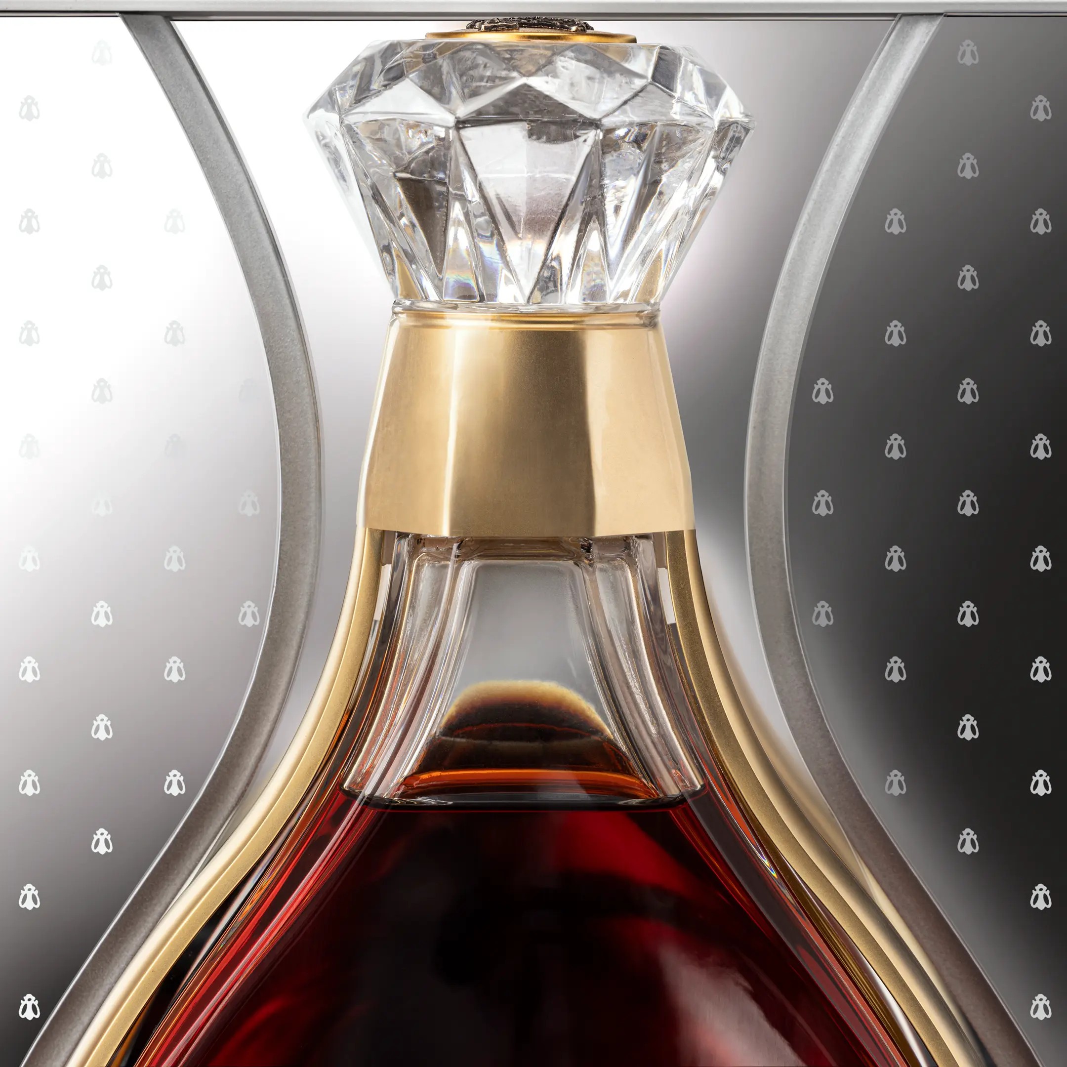
The iconic
teardrop
Structurally we developed modern renditions of the famed Josephine, Cognaçaise and teardrop silhouettes to reinvigorate the portfolio, drive distinctiveness and celebrate the brand’s next chapter. The bespoke XO decanter was modelled on the original bottle, first launched in 1984, with the middle of the decanter revealing a distinctive teardrop shape with movement incorporated into the sculpture of the glass to highlight the liquid.
Courvoisier Rouge Luxe
New Product Development
NAMING & COPYWRITING|
PACKAGING 2D & 3D|
PRODUCTION CONSULTANCY|
MODELS & PROTOTYPING
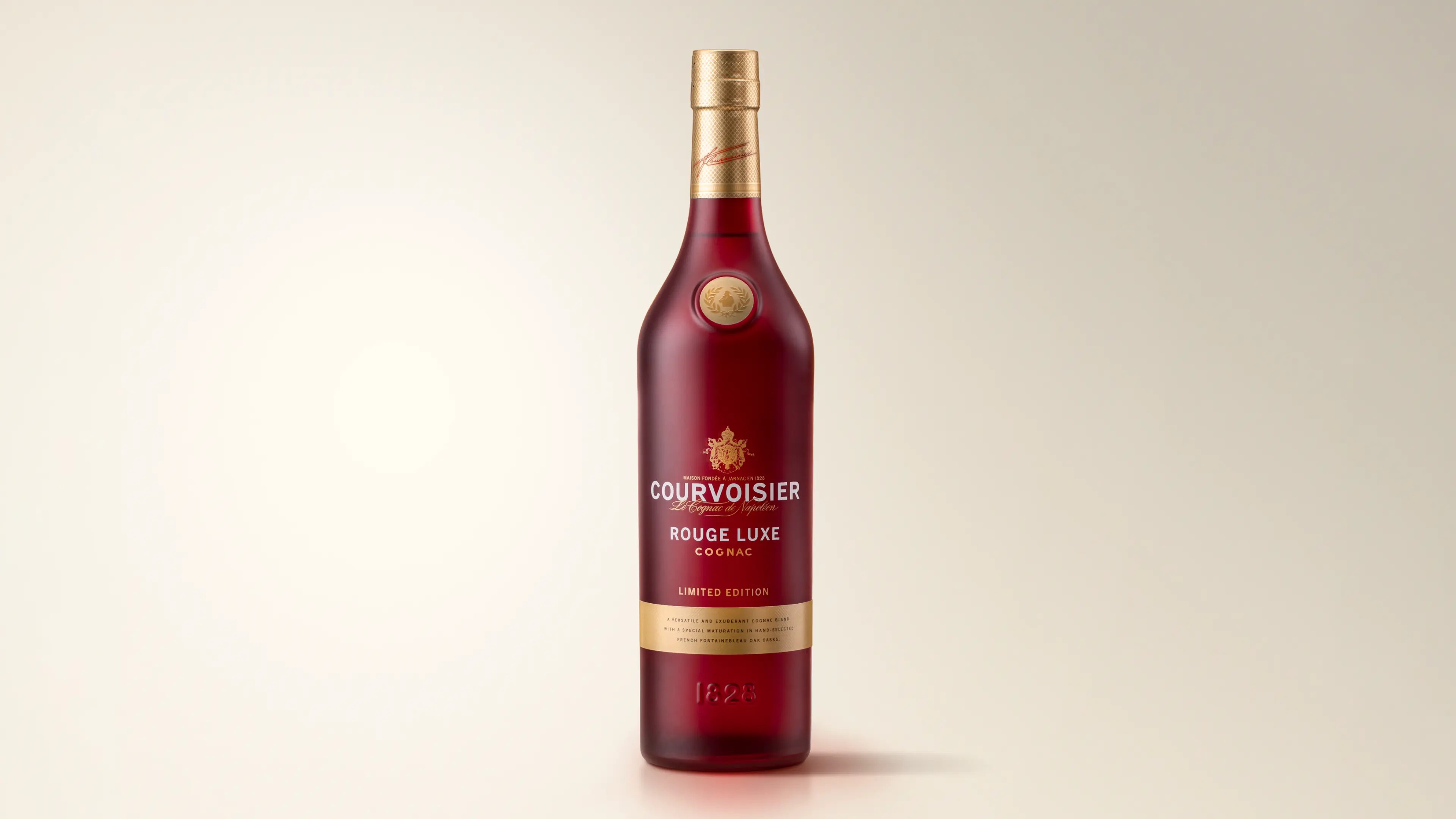
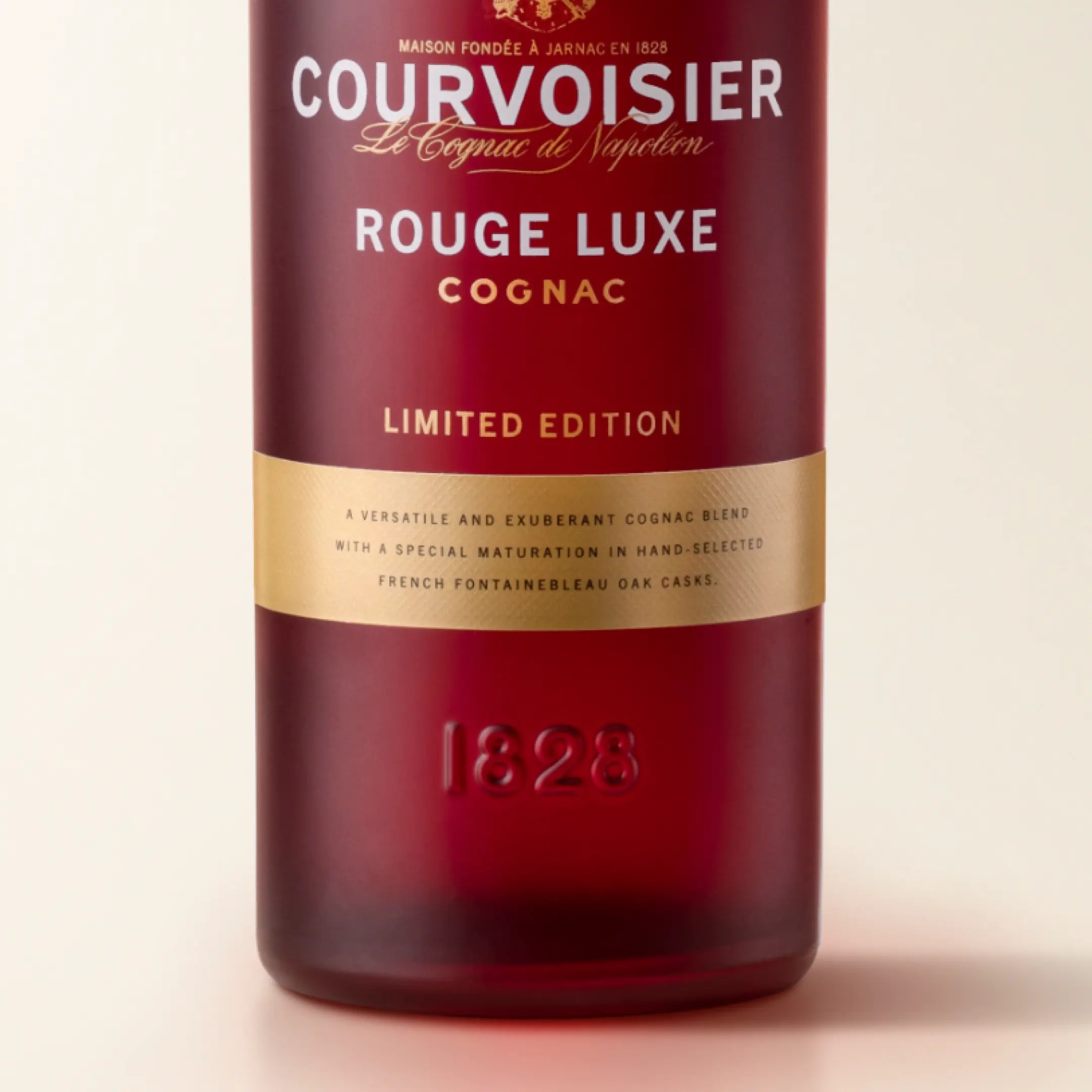
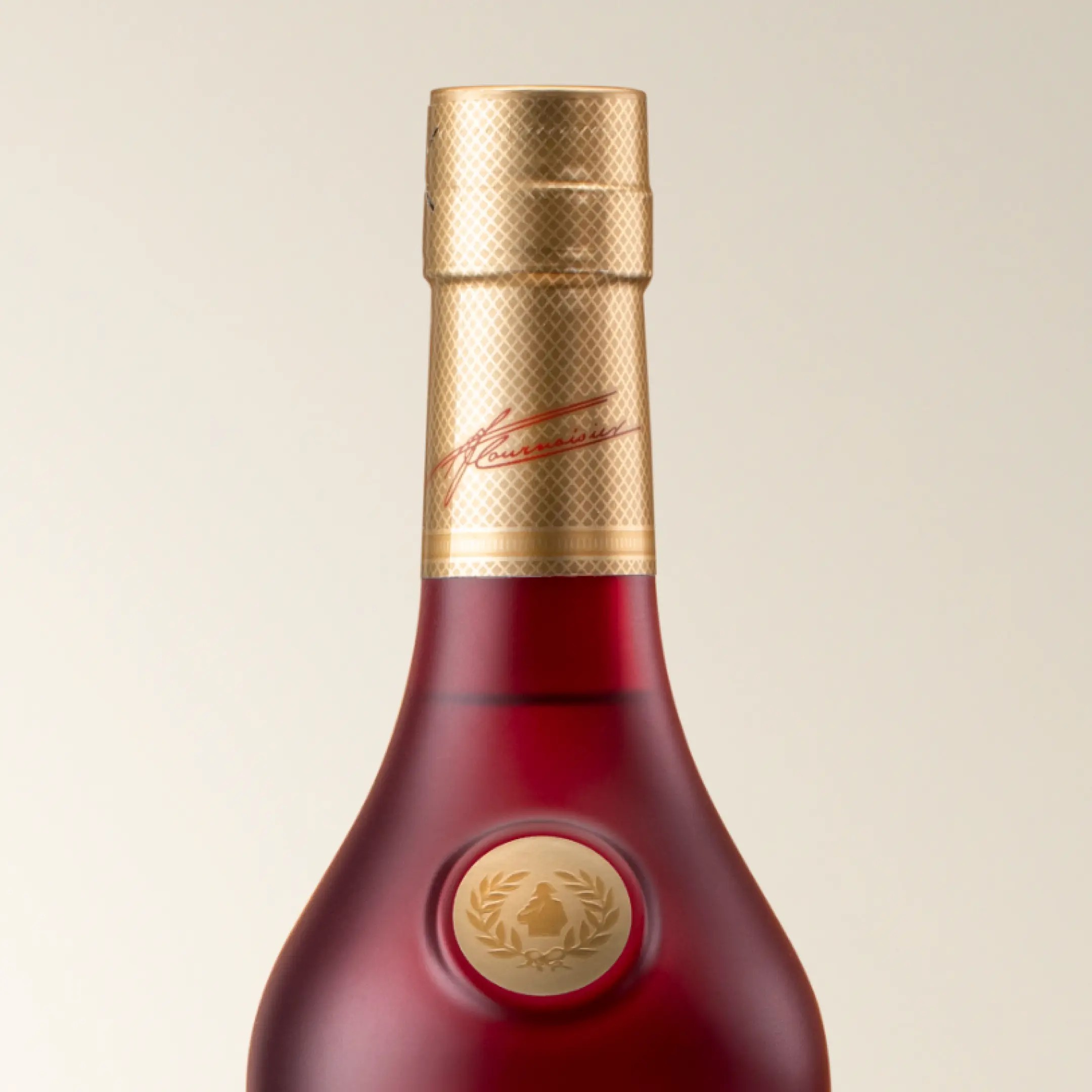
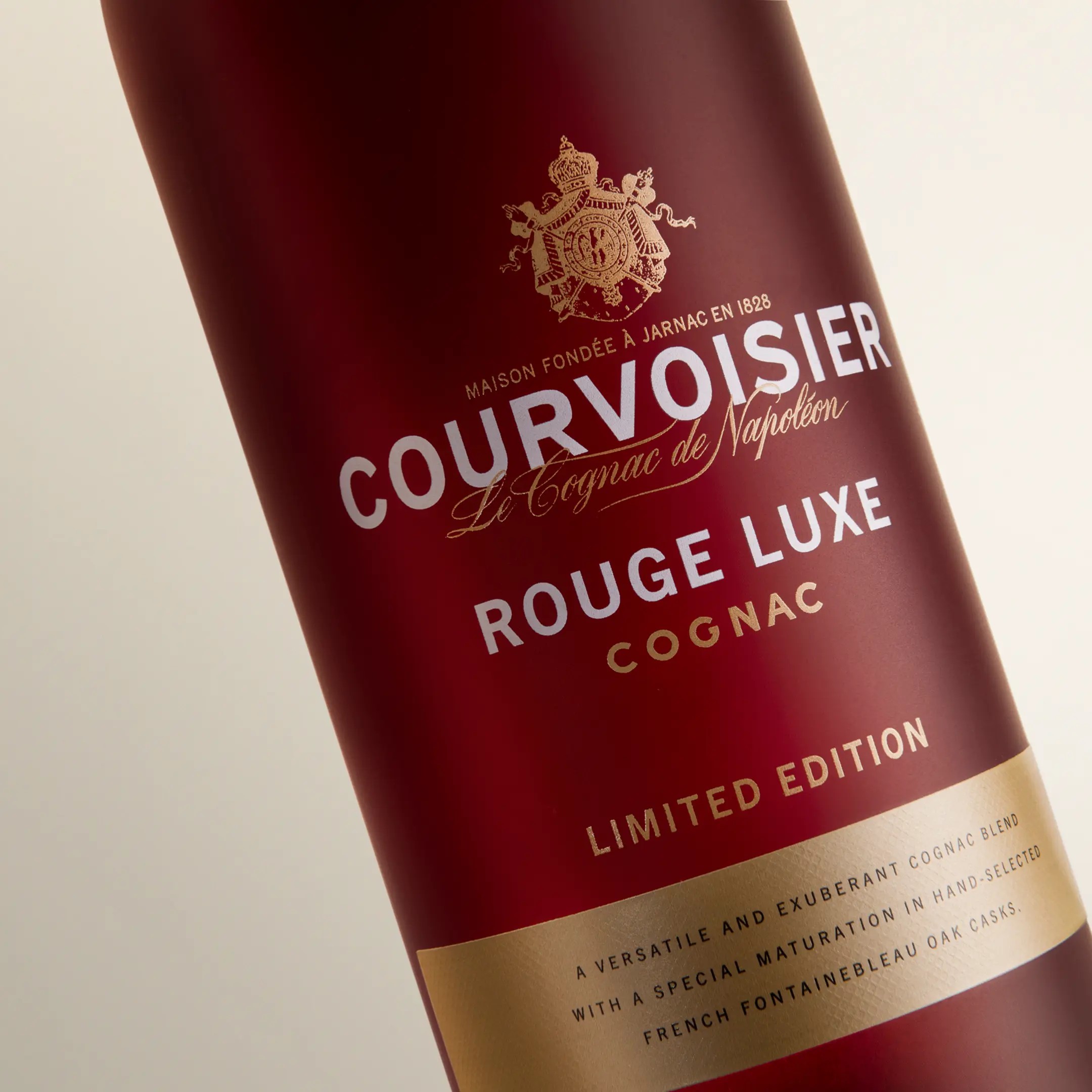
A festive
limited edition
Developed specifically to celebrate the Christmas season, Courvoisier Rouge Luxe represents the perfect blend of heritage and innovation. Crafted with the finest eaux-de-vie, this bold, yet smooth expression highlights the intricate balance between rich fruit notes and a delicate oak influence. The inspiration came from the iconic red and gold design present throughout the rich brand history.
Exclusively available in Tesco stores across the UK, Courvoisier Rouge Luxe is a limited edition that offers a unique opportunity to experience a rare expression of Courvoisier’s finest craftsmanship.
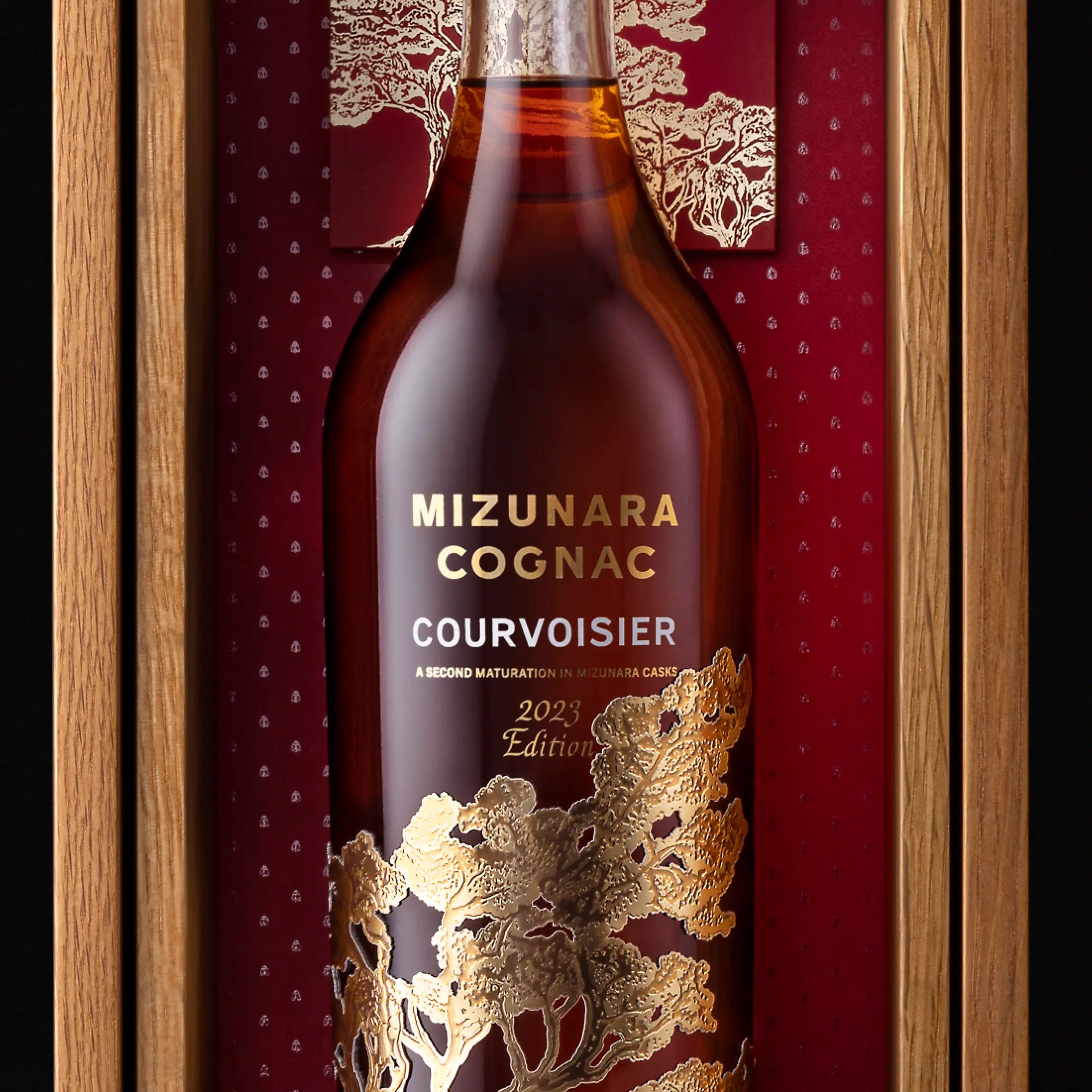
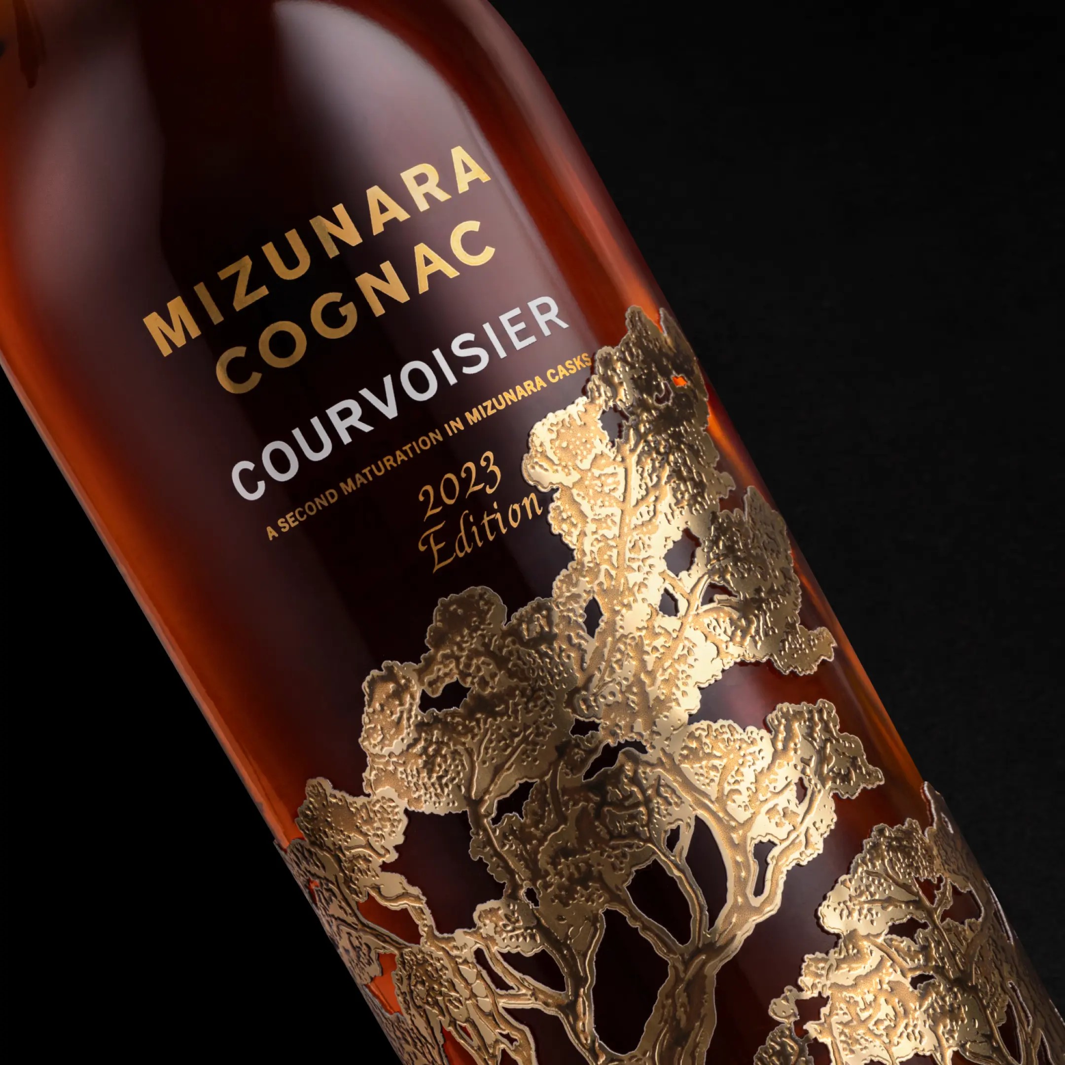
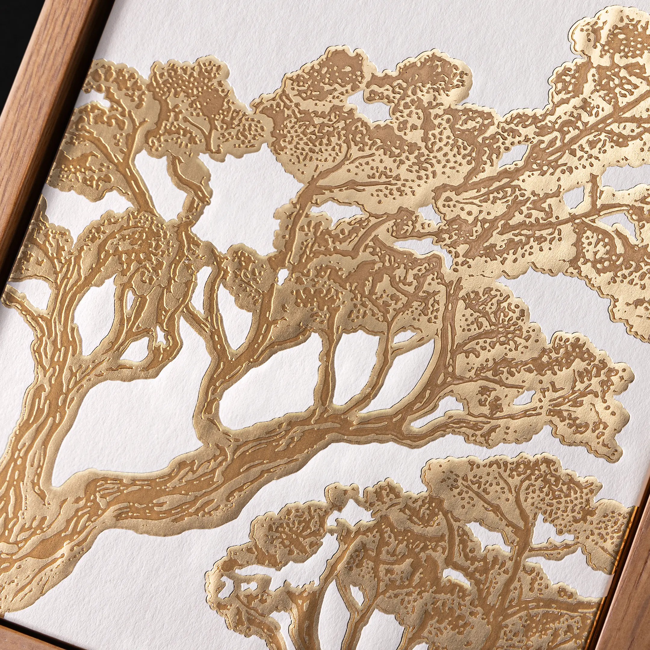
Courvoisier Mizunara
New Product Development
BRAND STRATEGY|
TYPOGRAPHY|
PACKAGING 2D & 3D|
PRODUCTION CONSULTANCY|
SUSTAINABILITY|
MODELS & PROTOTYPING
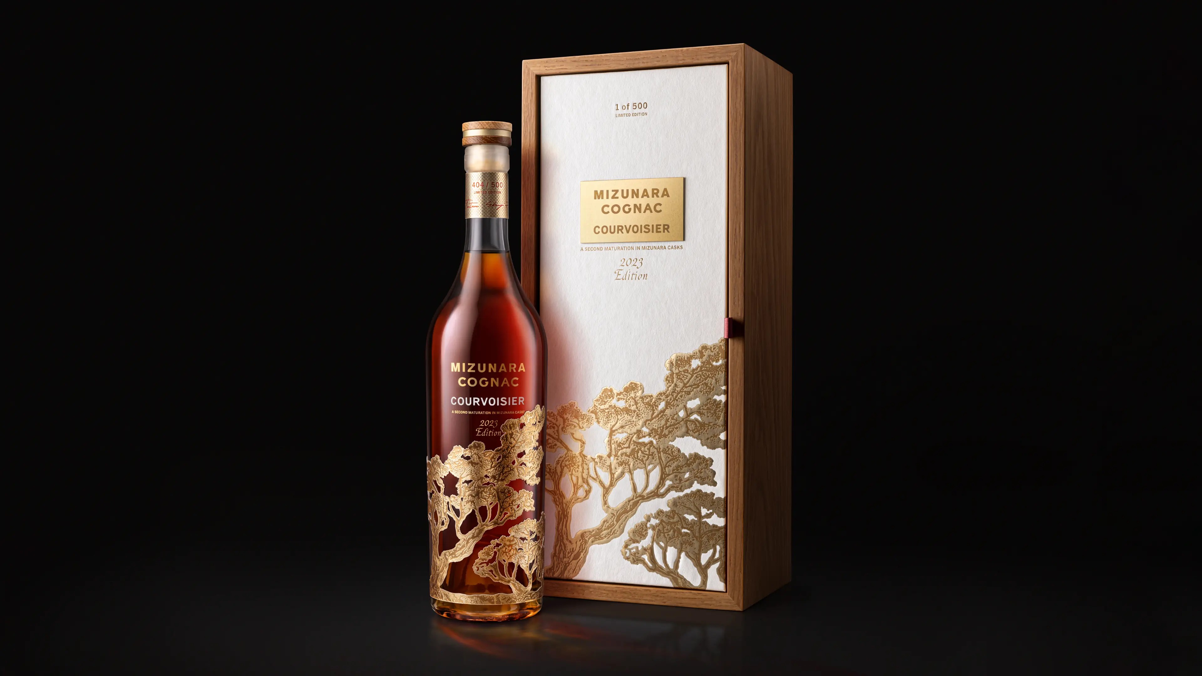
Where France
meets Japan
A truly visionary blend born from the collaboration of craft, culture and people. This limited edition of Courvoisier Grande Champagne is aged in Japanese Mizunara oak casks. The understated elegance of our bottle and box provides a raw canvas for the legendary Mizunara tree illustration – look closely and you will discover maps of both France & Japan. Natural materials, refined use of gold and a recessed booklet come together to tell the story of this unique collaboration – signed off by both French and Japanese master blenders.
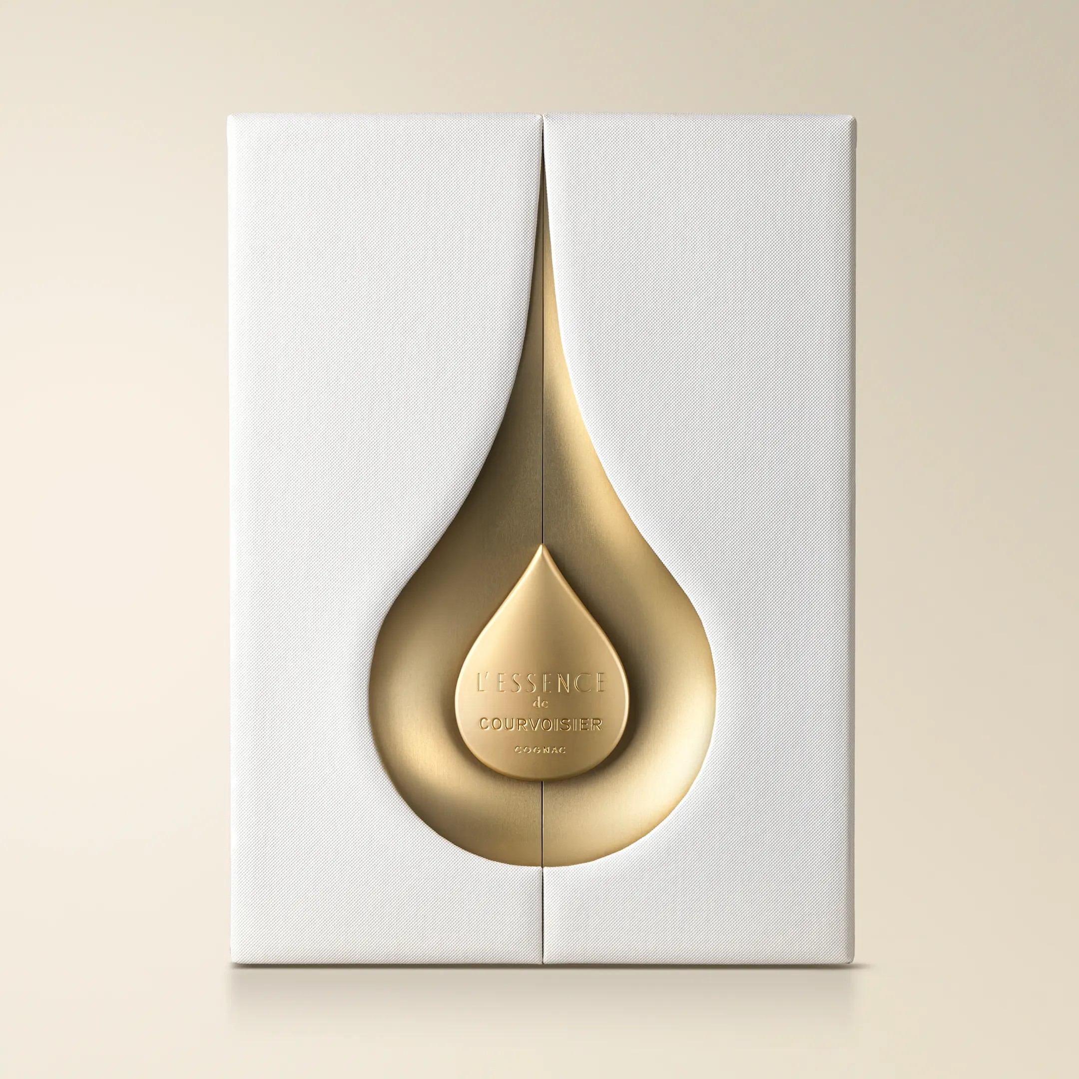
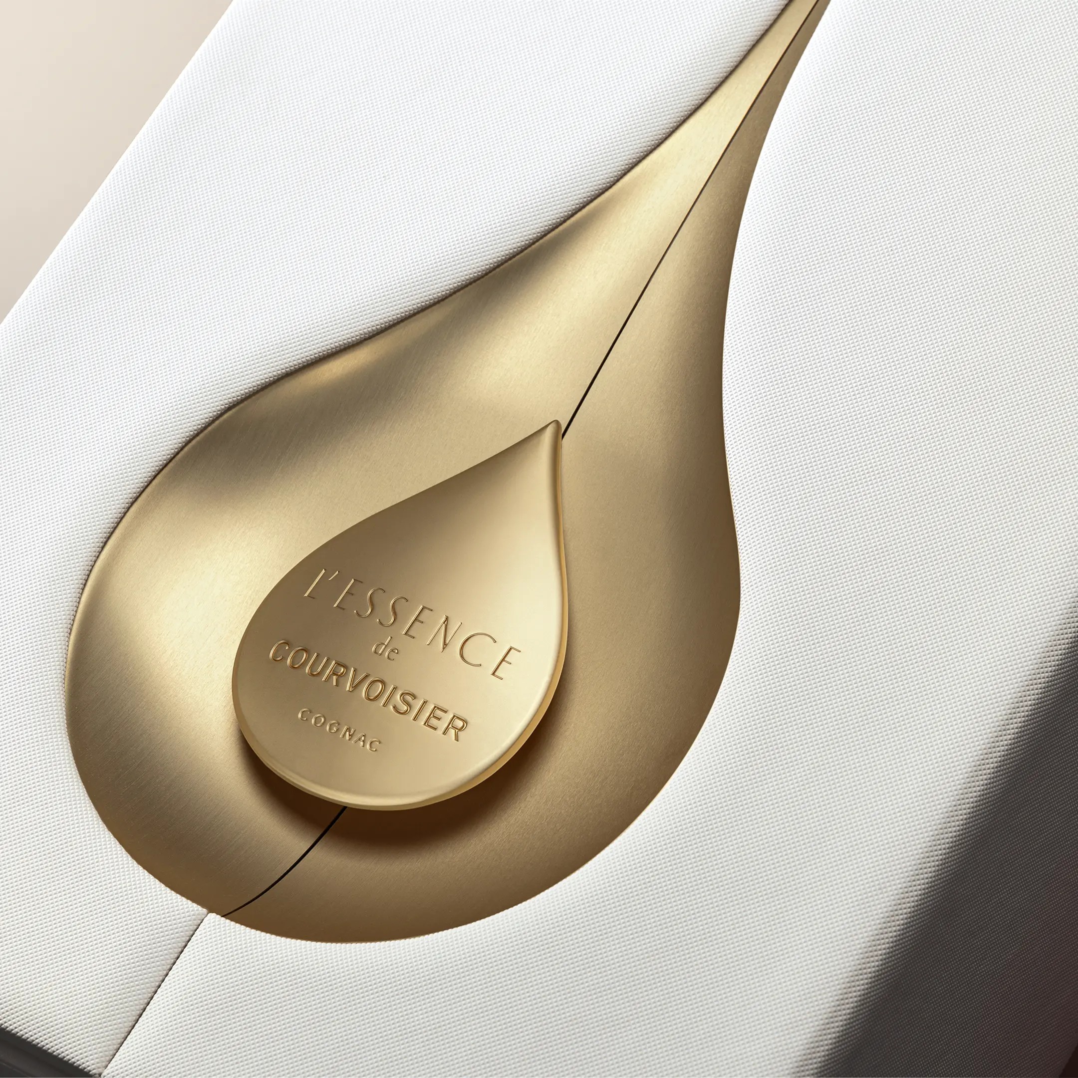
Courvoisier L’Essence
Packaging Redesign
PACKAGING 2D & 3D|
PRODUCTION CONSULTANCY|
MODELS & PROTOTYPING
The Essence
of Elegance
L’Essence is the treasured jewel, the icon of Maison Courvoisier. The redesign was all about elevating the packaging details to the level of elegance and refinement that this price tier demands, while staying true to the intention and distinctiveness of the original design. Blended in 2009 by the fifth generation master blender Jean-Marc Olivier and sixth generation master blender Patrice Pinet, L’Essence is where old meets new. The result is a journey of the senses that expresses the artistry of Courvoisier.
Explore more of our WORK